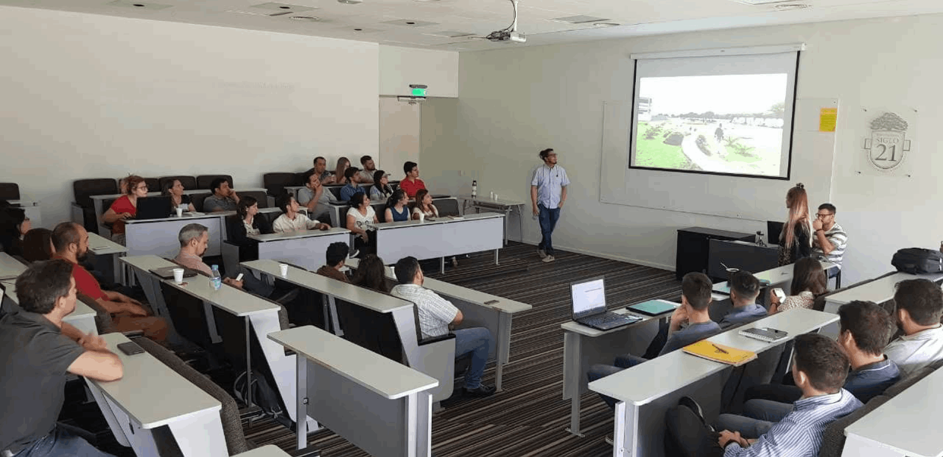
Algarrobo team
Problem statement
Most of the students uninstall or do not use the application due to its poor usability and performance. In addition to that some functionalities that they needed were only on the website version.

Algarrobo team
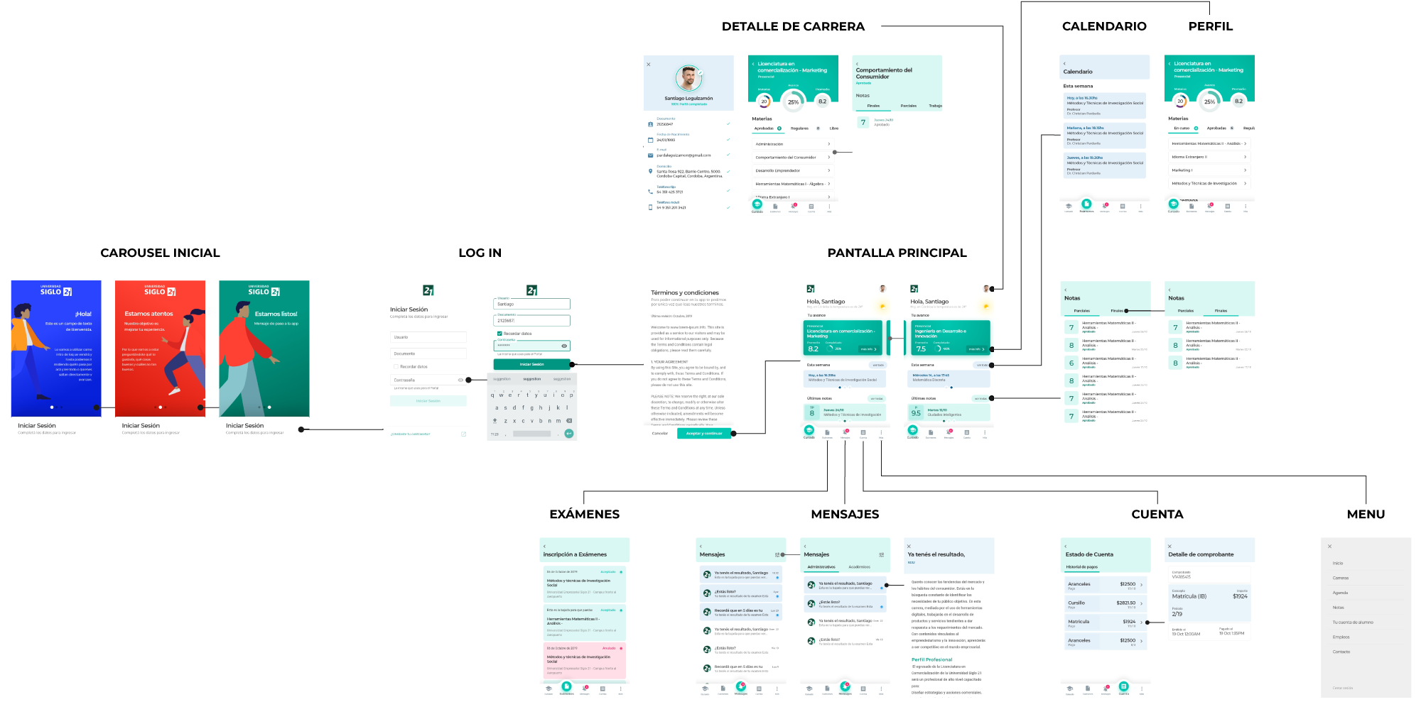
Workflow
To design the Design System I relied on the wireframes to define the necessary components and developed the basics using atomic design concept in Adobe Xd.
Then when the web version of the product was added, I developed a specific one for it, always maintaining experience consistency with the mobile app, taking into account that the web would be developed using Angular while in mobile we used Flutter.
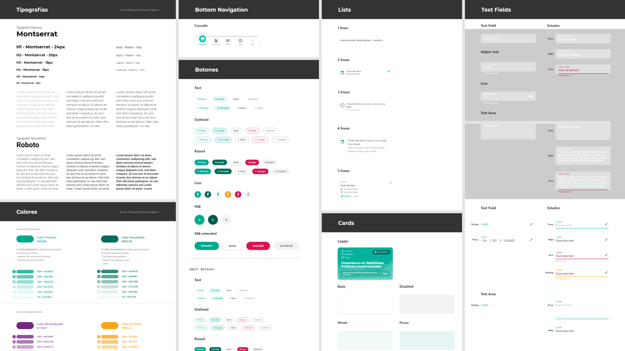
Mobile Design System
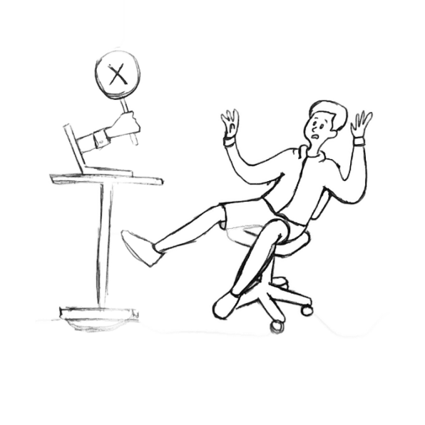
To empathize with the students, I drew and animated the empty states and error states. First drawing with pencil and paper, vectoring with Adobe Capture, corrections and color in Illustrator, ending with animation in After Effects.






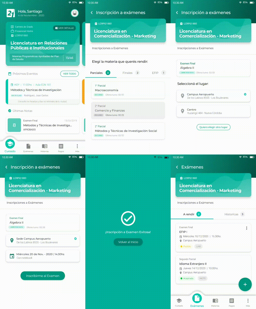
Registering to an exam mobile app
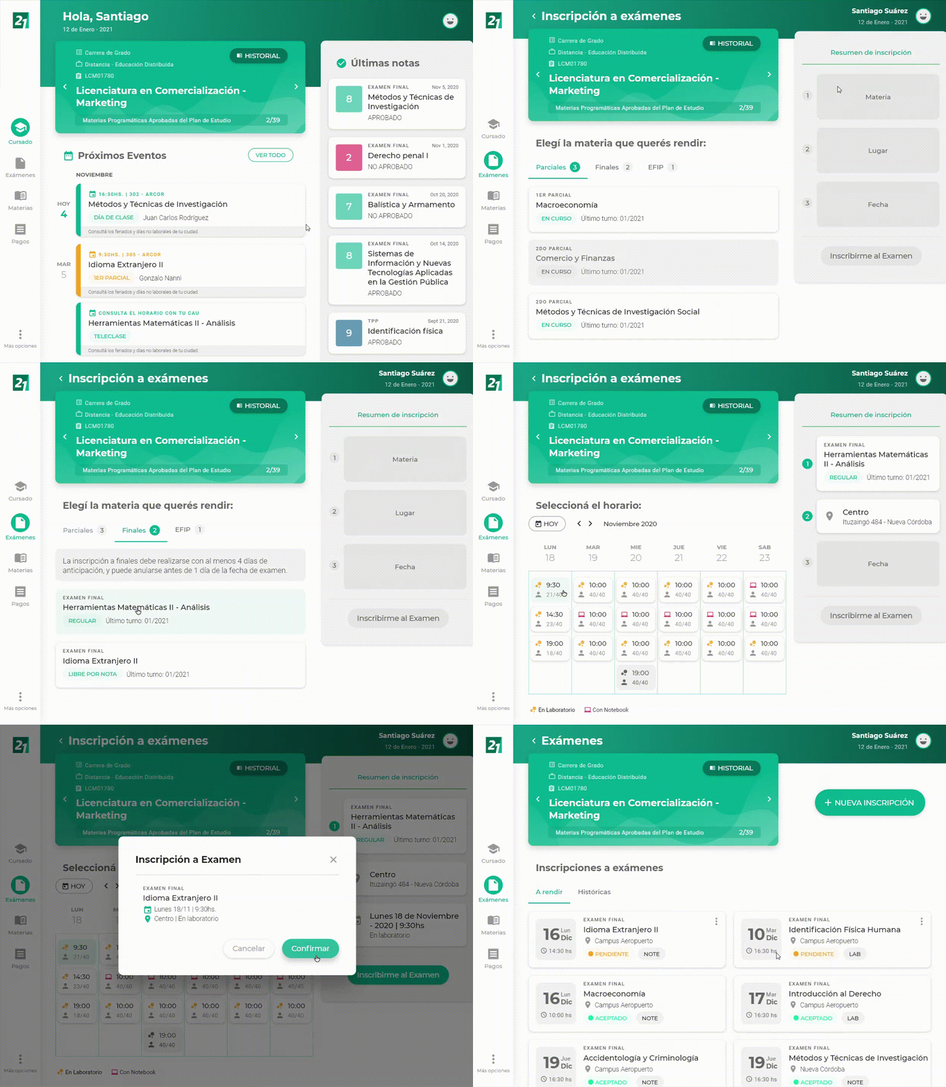
Registering to an exam webapp
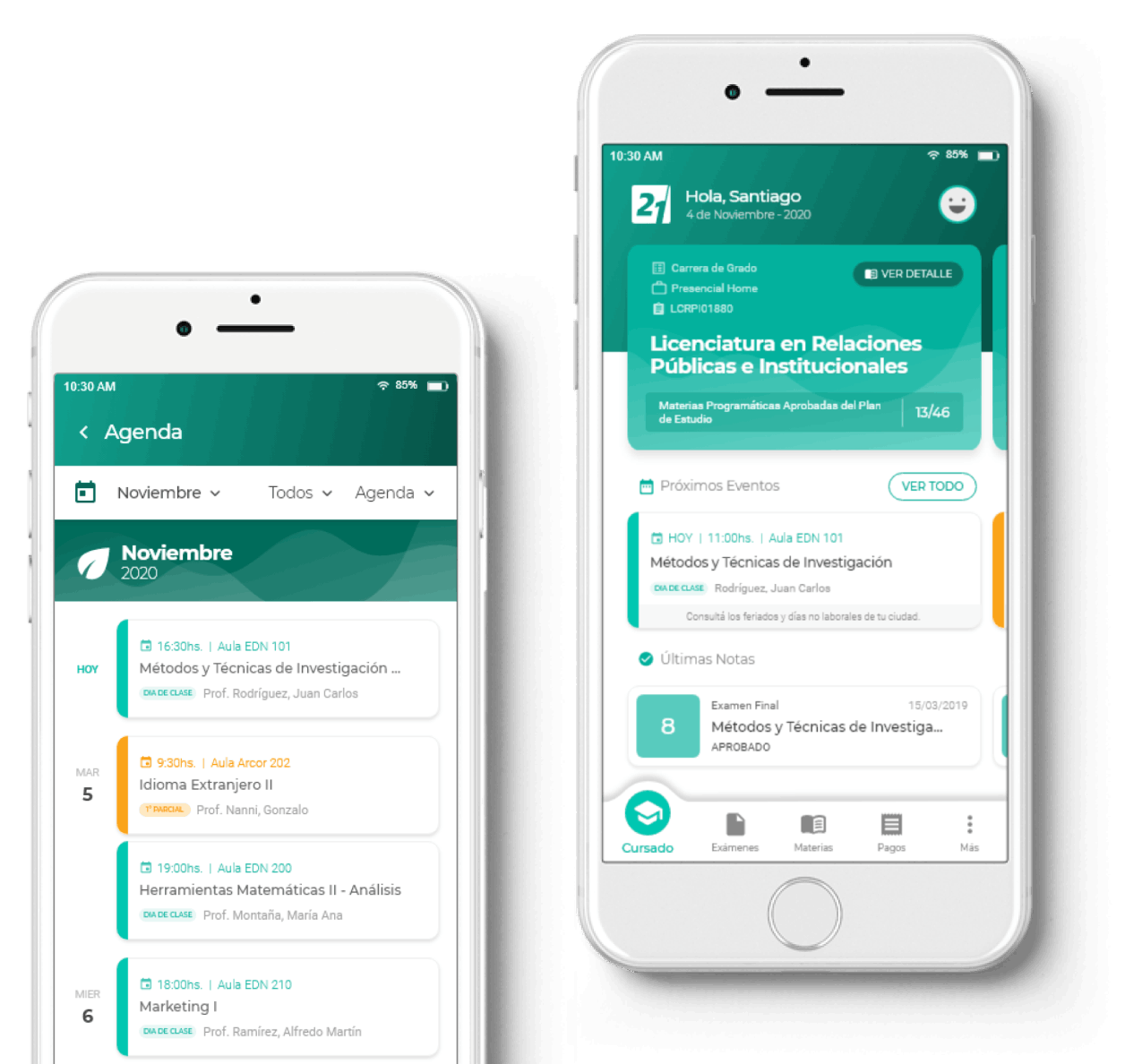
On the home screen, the student has a widget that contains the main information about his career, upcoming events such as lessons and exams, and the latest grades.
If the student is taking another career or courses, they can easily access it by swiping the main card.
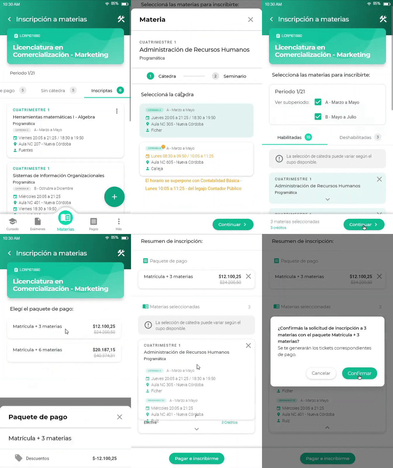
Course registration flow
Students can register for courses and exams. The registration flow is divided into a sequence of simple steps and at the end the user can check a summary of their choices to confirm or modify.
In the design of the experience we took into account each special case that may occur, such as overlapping schedules with another course. Also, I considered how the cards adapt when the content is of varying lengths.
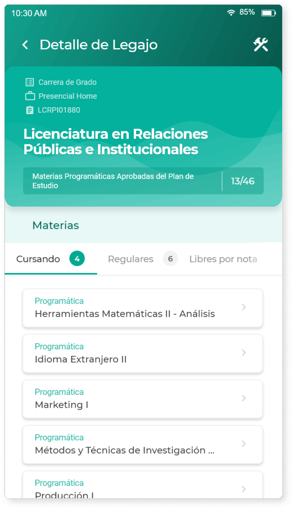
Check state of courses, completed exams, grades.
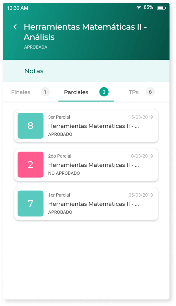
Check intermediate and final grades.
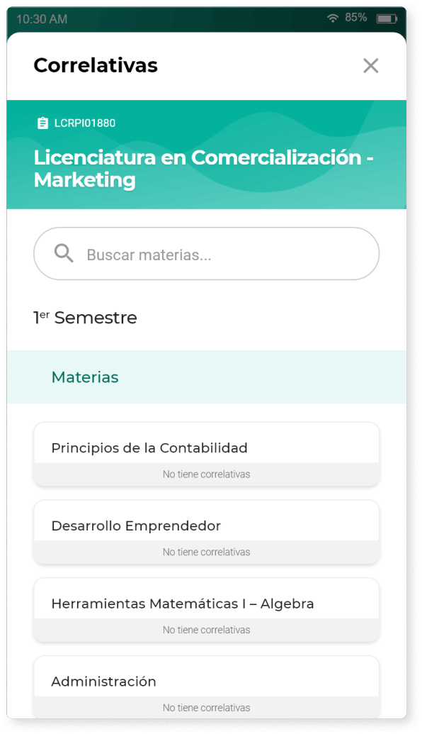
Check the correlatives to shape the study plan.
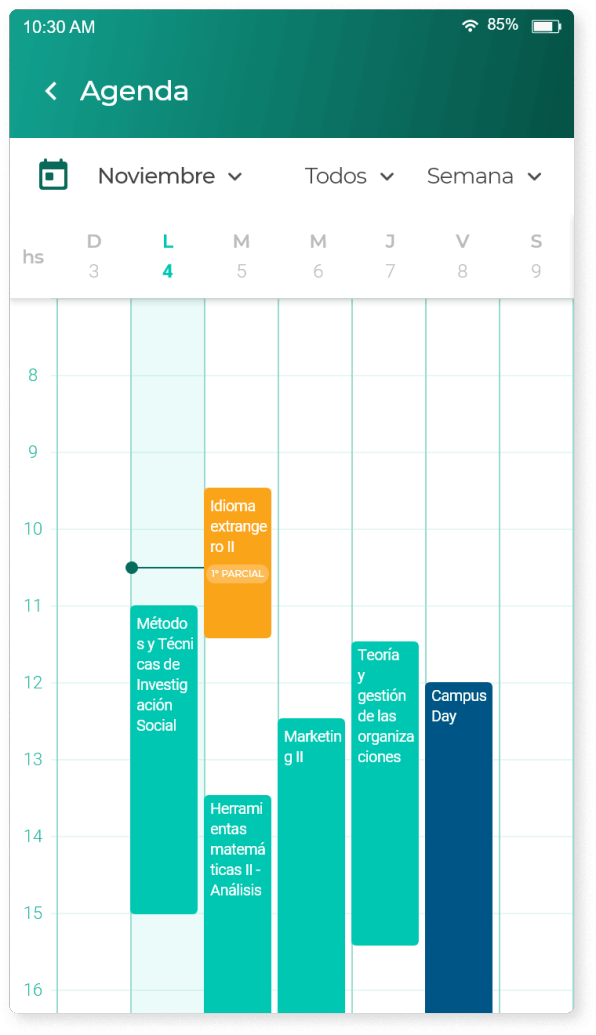
Check lesson, exam and events date.
Next project